Imagine you're at a busy café, enjoying a latte, and checking your favorite online store on your phone. Everything works great—the images load fast, the text is clear, and the buttons are easy to press. You're fully engaged and end up buying something without hesitation. Now, think about a website that loads slowly, with tiny text and hard-to-press buttons. It's frustrating, right?
This shows how crucial mobile-first design is today. With more people using mobiles than desktops, making your site mobile-friendly is key. It keeps users interested and helps you make more sales. By focusing on mobile users, you can reach more people and improve your online presence.
What is Mobile-First Design?
Mobile-first design means making websites for the smallest screens first. Then, it adds more features for bigger screens. This way, websites work well on all devices, starting with phones.
This method focuses on what's most important for mobile users. It makes sure people on smartphones have a great time visiting your site.
Understanding the Mobile-First Approach
The mobile-first approach puts mobile users first. Designers make sure the site works well on phones. This means making content simple and easy to use on small screens.
By making things simpler, you make your site easier to use. This makes it easier for people to find what they need.
Prioritizing Mobile User Experience
Improving the user experience means focusing on touch-friendly navigation and fast load times. Responsive design helps your site adjust to different screen sizes. This makes your site work well on phones, tablets, and computers.
By using these strategies, you make sure mobile users have a great experience. This creates a better online environment for everyone.
The Rise of Mobile Internet Usage
In recent years, mobile internet usage has changed how we use the web. Now, over half of all web traffic comes from mobile devices. This shows a big need for making your website work well on mobiles.
Mobile browsing has changed how people act online. Users want websites that work well without needing to zoom in or click a lot. If your site doesn't meet these needs, you might lose customers. Making your site work on all devices helps keep users happy.
To reach people who use mobile devices a lot, focusing on mobile optimization is key. This approach helps meet user needs and use the growing trend of mobile internet. As mobile use grows, keeping up with mobile web design is crucial to stay competitive.
Benefits of a Mobile-First Website
Creating a mobile-first website brings many benefits that boost your site's performance and user interaction. More people now use mobile devices to access the internet. So, making your site mobile-friendly is key to a better user experience.
Improved User Experience
A mobile-first website makes things easier for users. This means:
- Longer session durationsas users find it easier to navigate.
- A decrease in bounce rates, driving more engagement.
- Faster load times, which makes browsing a breeze.
These improvements lead to a more enjoyable visit, making users more likely to come back.
Better SEO and Search Rankings
Choosing a mobile-first design also helps with your search rankings. Search engines like Google prefer sites that work well on mobile. The benefits are:
- Enhanced compliance with search engine algorithms.
- Higher chances of ranking better in search results.
- Increased traffic from organic searches, attracting potential customers.
By focusing on mobile-first design, you make your site better for users and for search engines. This leads to better SEOand improved search rankings .
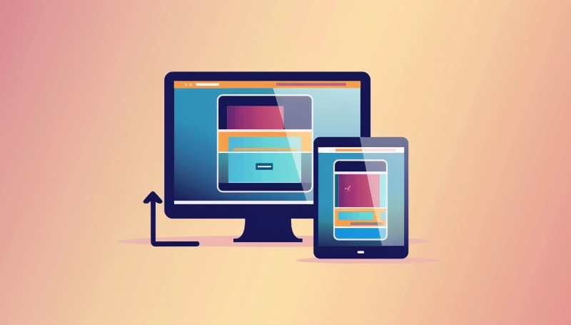
Responsive Design vs. Mobile-First Design
It's key to know the difference between responsive design and mobile-first design to make your website better for users. Both aim to make browsing easy on different devices. But, they use different ways to do it.
Key Differences Explained
Responsive design changes layouts based on the screen size. It starts with the desktop version and scales down for smaller screens . This method uses flexible images and grids to make sure content fits any device well.
Mobile-first design, however, starts with the mobile layout. It focuses on making a great experience for mobile users first. Then, it expands to larger devices. This way, it ensures a smooth user experience on mobile.
Both methods make websites more accessible and easy to use. But, the choice depends on your website's goals. If most of your visitors use mobile, mobile-first might be better. Knowing these differences helps you make better choices for your site.
Mobile-First Design Principles
Using mobile-first design changes how you make your website for better user interaction. It puts content first to make sure visitors can easily find what they need, even on small screens. This means making sure important content is easy to see, leading to happier users.
Content Prioritization and Hierarchy
It's key to have a good plan for what content to show first in mobile design. Here's how:
- Put important infoat the top to grab attention right away.
- Use empty spaceto avoid clutter and make reading easier.
- Place images wiselyto help users navigate and understand better.
These steps help users quickly spot what they need and understand important info. A clear visual order not only makes for a better experience but also gets users more involved with your content.
Optimizing for Mobile Performance
It's crucial to make sure your mobile design works well to keep users interested. Fast load times mean users are more likely to stick around. Studies show that if a site doesn't load in three seconds, people often leave.
Working on page speed helps make your site smoother. This makes users want to explore more of your content.
Load Times and Page Speed
To make your pages load faster, try these tips:
- Minimize HTTP requests:Fewer elements on a page mean quicker load times.
- Utilize caching strategies:Caching stores data so it loads faster for repeat visitors.
- Compress images:Compressing images helps your site load faster without sacrificing quality.
Using these tips in your mobile design will boost user happiness. It will also make your site work better and more effectively.
Designing for Smaller Screens
When making a website for mobile first, you need to change how you design. You should think about touch controls, how easy the text is to read, and what shows up right away. These things make the user experience better.
- Prioritize essential features:Make sure the most important parts are easy to find and use.
- Reduce clutter:A clean design helps users move around without getting lost.
- Optimize for touch:Make buttons and links big and easy to tap, so users don't get frustrated.
Using mobile-first design, you can make parts of your site work well on small screens. This makes using your site easier and more fun for visitors. Knowing how to design for small screens helps keep people interested and happy.
Enhancing the Mobile Experience
Creating a great mobile experience is all about making navigation and interaction easy. A clear, easy-to-follow navigation helps users move through your site smoothly. Making every touchpoint friendly boosts the user experience a lot.
Intuitive Navigation and Interaction
For a mobile-first design to work, it must be easy to navigate. Users should quickly find what they're looking for. Here are some tips to make it happen:
- Gesture-based navigation: Use swipe and tap gestures for a more natural feel.
- Larger tap targets: Make sure buttons and links are big enough for fingers, so users don't get frustrated.
- Drop-down menus: Use streamlined menus to keep things tidy and let users explore without getting lost.
By focusing on user experience, you make your site easier to navigate and build a loyal mobile audience. A well-designed mobile site makes interacting with your content smooth, encouraging users to come back.
Implementing a Mobile-First Strategy
Creating a mobile-first design means focusing on mobile devices from the start. Begin by setting clear goals for your users. This helps you understand what mobile users need. Gathering data on how users behave can also give you insights into what they like and dislike.
User testing is key. Get feedback at different stages of your project. This makes sure your mobile design meets user expectations. Improving your design based on what users say makes a big difference.
- Focus on essential features that deliver the most value to users.
- Ensure navigation is simple and intuitive, allowing for quick access to content.
- Optimize images and resources to boost load speed, enhancing overall performance.
Keeping up with mobile trends is vital. Regularly check and adjust your plans to keep your site effective and easy to use. Putting these steps first ensures your mobile design is strong and meets your audience's needs.
Progressive Enhancement and Graceful Degradation
In mobile-first design, using progressive enhancement and graceful degradation is key. These methods help make sure everyone has a good experience, from the newest phones to older ones. They make sure quality doesn't drop, no matter the device.
Fallback for Older Devices
Progressive enhancement makes sure all users get the basic stuff first, then adds more for those with newer devices. This means your site's main parts should work on any device, even the old ones. Graceful degradation makes sure your site still works on older systems, even if they can't handle the latest stuff.
To use these strategies well, think about adding fallback options for advanced features. Here are some key tips:
- Use basic HTML structures:Make sure the basic layout is good for all devices, then add CSS for style and more features.
- Provide alternative content:Give text options or simpler versions for things like videos.
- Test across multiple devices:Check your site on both new and old devices often to make sure it works for everyone.
- Implement responsive design:This approach fits with both progressive enhancement and graceful degradation . It makes your site work well on different screen sizes and keeps it easy to use.
Testing and Optimization
Rigorous testing and optimizationare key in mobile-first design. Using different testing methodshelps you see how users interact with your site. Here are some ways to test:
- A/B testing: Compare two versions of a webpage to see which performs better.
- Usability testing: Gather feedback from real users to identify areas for improvement.
- Responsive testing tools: Use these tools to verify that your site functions well across different devices and screen sizes.
It's important to track user behavior through analytics. This helps you make smart choices. Look at data to see how visitors interact with your site. Note what might make their experience harder.
Update your mobile-first design with user feedback to improve the experience. This cycle of testing and optimizing keeps you ahead of what users want. It makes sure your site stays useful and effective in a fast-changing online world.
Mobile-First Design Best Practices
To make the most of mobile-first design, focus on improving the mobile user experience. Start with easy navigation so users can quickly find what they need. A simple menu and user-friendly design help keep visitors interested in your content, which boosts retention.
Quick load times are key for mobile optimization. Users want fast access to information. Use optimized images, reduce server response times, and use browser caching to help. Also, make sure your content is relevant to your audience. This makes users happy and helps your site rank better on search engines.
Regularly check your design and content for mobile compatibility. Keep up with new trends to adjust your mobile-first design. Always look for ways to improve—use user feedback, do usability tests, and update your site for mobile users.